

PERLA TENORIO - BRIDAL COUTURE
More is More


Perla Tenorio is a fashion designer with a clothing line of bridal couture and everyday casual fashion for empowered women in Lima, Peru. She needed consistency and clarity in her positioning strategy to stand out.
She came looking for a minimalist feel and left realizing; it wasn’t her style. We opted to embrace her natural inclination for maximalism and let ourselves get inspired by her French education background.
BRAND STRATEGY
BRAND IDENTITY

Details Matter
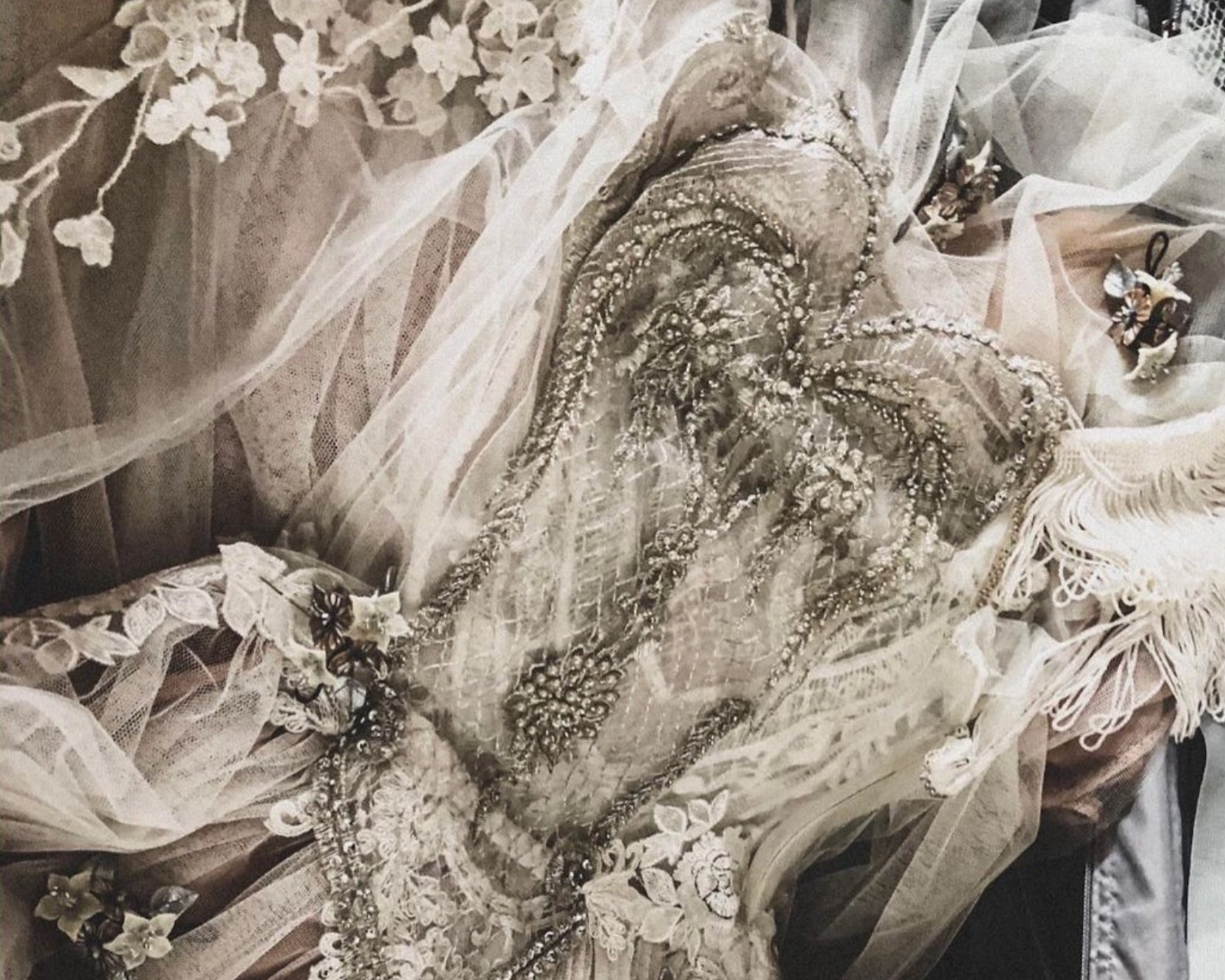
During our brand workshop, Perla said to me: More is More. This belief became an essential element of the visual approach and the values we decided to highlight for her strategy and identity.
The concept of “more is more” did not mean “quantity over quality” to her. It was more about “details matter.”
You only have to see her dresses to know she cares about each bead, applique, and embroidery piece that goes into her garments.
We wanted to showcase this by choosing a combination of typefaces that felt intricate, romantic, and far from minimalist. The layered logo built of a monogram, a two-line serif logotype, a highly ornamental script, and a minimal san-serif descriptor was the perfect fit for her brand.
VINTAGE
/
ROCOCO
/
ELEGANT
/
ROMANTIC
/
ARTISTIC
/
VINTAGE / ROCOCO / ELEGANT / ROMANTIC / ARTISTIC /


Something Blue

We also wanted a way to differentiate her bridal line from her casual everyday collections, so we added something blue. If you are familiar with the wedding industry having something blue is a tradition that symbolizes luck for a bride on her wedding day. We used a hue that matched the softness of her brand, as a unique accent for her bridal garments and packaging.


NOT JUST BRIDAL COUTURE
“Powerful Outfits for
Empowered Women”

Creating visual consistency with two lines of clothing of different looks was the main challenge in this project. Visually we needed to tell them apart while maintaining overall brand consistency. We opted to solve this by selecting a color combination for each line and by grouping the launch of outfits by seasonal collections.


Brand Consistency
We recommended slowly applying her new branding to all elements of her client experience. From bags, thank you cards, stickers, labels, and even clothing hangers, it should all feel like one brand experience. The attention to detail she pours into her garments should be present in her everyday collections, daily content creation, packaging, and brand photography.


