

KUSKA
Hippie Warmth over Dark Punk


Diego and Paula have been my friends and clients for a long time. I created a brand for them five years ago that they outgrew, and it was time to dive deeper with a more mature strategy to set them up for the future. We wanted a brand that represented their growth and current level of craft while keeping their chilled and outgoing personality at the forefront.
BRAND STRATEGY
BRAND IDENTITY
CONTENT STRATEGY
TEMPLATE CREATION
BUSINESS CARDS DESIGN


More of Both of You
Diego and Paula’s personality is unique. They are both the nicest people you could meet, everyone loves them. They are funny, light-hearted, and a bit quirky. As their friend, I wanted to showcase their quirks with the use of fun copy and with a bold typography choice. I recommended putting some extra work into creating captions that felt personal, relatable with storytelling to retain their audience’s attention. Their audience needed to experience not only what they do; but also who they are.

HUMBLE
/
TRANQUIL
/
CREATIVE
/
WARM
/
VINTAGE
/
HUMAN
/
HUMBLE / TRANQUIL / CREATIVE / WARM / VINTAGE / HUMAN /


Hippie Warmth over Dark Punk
They asked me to incorporate a “rebel” feel to their brand. They like exploring different editing styles and pushing the traditional format, but the rebel vibe they were looking for was too dark and punk for them. I proposed another approach, with more of a “hippie” vibe, an art direction they loved and felt better represented them.


Quirky Phrases
While defining their voice’s tone, something extra we did was listened to Diego’s Podcast to identify which phrases were common to both. We picked the quirkiest and we made them part of their language. One of their descriptors: “retratistas de parejas que derrochan amor a montones,” was inspired by this exercise.

Vintage Vibes


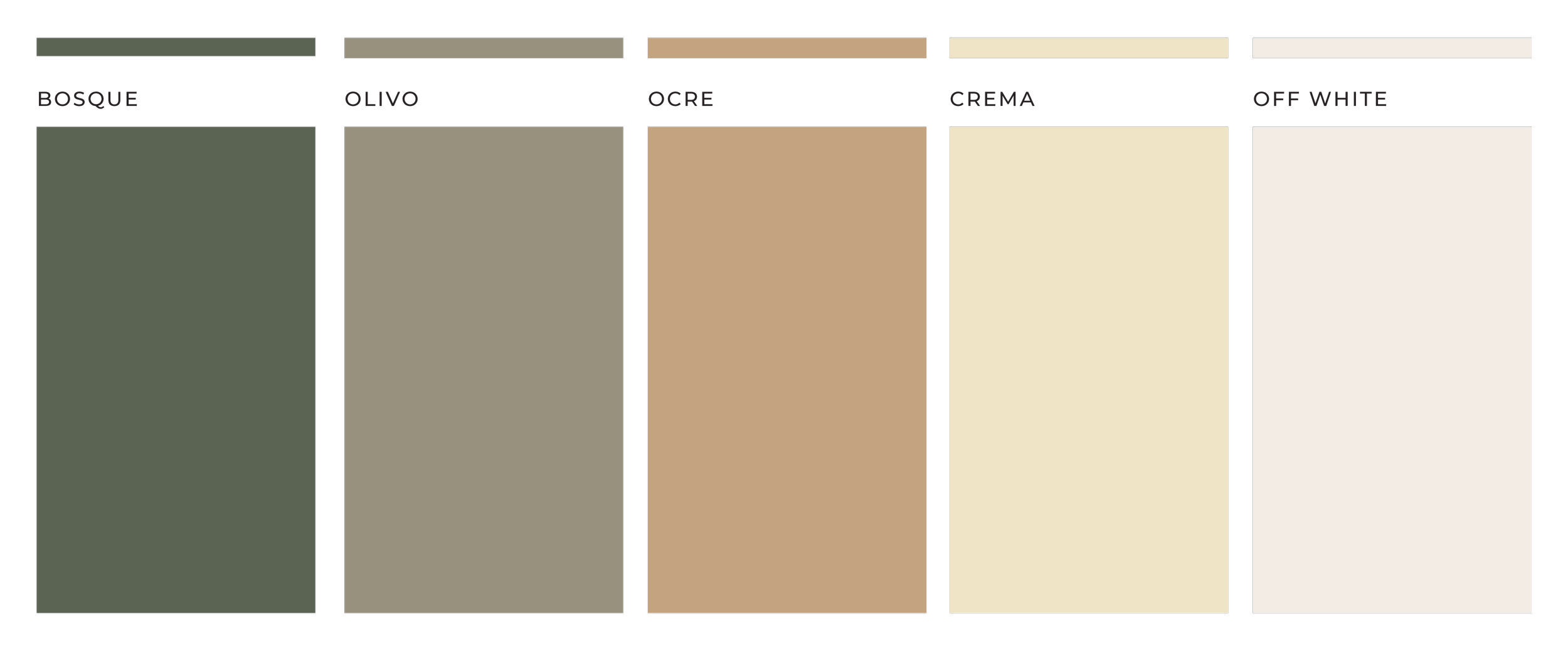
Diego and Paula needed a specific visual style to help them immediately differentiate their work. We opted for a vintage treatment because their work allows their clients to remember and relive the past through videography which conceptually was the best fit for them. The colors, fonts, and grainy editing were all purposeful hints at the past with timelessness to outlast all trends.


