
Falling For You—Fall Seasonal Inspiration

Feeling inspired and creative for seasonal content can be challenging.
The last three months of the year bring lots of stress for many people, especially entrepreneurs. Lots of insecurities can flourish around this time. If you don’t offer a seasonal product, this could mean a (painful) slow season, where we become victims of impostor syndrome or burnout. For businesses that offer seasonal products, it could also mean, it’s GO time with no slowing down for you. Either side brings its own challenges.
I know for me, it also means Halloween costumes, Thanksgiving recipes, preparing for Christmas (financially) and gifting ideas for each member of the family, planning for Zara’s birthday… It can get overwhelming pretty quickly. Not to mention, the end of the year also brings this sort of pressure to revisit some of the goals I set for myself at the beginning of the year… NUTS.
“Slow down & admire your surroundings. Inspiration comes from anything and everything.”
One day at a time
If you are feeling a bit overwhelmed, let’s take it one day at a time. Not thinking so far ahead that we forget to enjoy each season to its fullest. Go for a walk, light up a candle, bird watch while having your morning coffee… All these will help you slow down, and the more we do, the more we get to see and feel inspired by our surroundings.
Seasonal Inspiration Ahead
I get lots of inspiration from photography, styling, and floral arrangements, especially during Fall. I love thinking about the thought that goes into creating these images… it gets my creative juices flowing!!! I pay attention to the use of textural backgrounds, the choices of styling, and the photography editing... They all communicate something..
Whether you are planning for a seasonal shoot soon; or working on content creation, I have gathered a few images that got my fall, spooky self ready to tackle the last two weeks of October and November. I would love to share them with you.
SLIGHT WARMTH
Something I have learned from admiring other makers is that it takes as much effort and skill to start creating as it does to know when to stop and practice restraint. Styling is not just about bringing props and arranging them nicely, it is also about recognizing when a point can be made without overdoing it.
With seasonal content, over-styling can be done easily; and in my humble opinion, it can be incredibly distracting when trying to sell a product with photography.
I love this example, because of its simplicity. A weathered piece of wood, linen movement through folds and shadows, slight background blur, and done. As a result, a slight hint of Autumn, which is all this product needs considering the scent name “Pumpkin…” is front and centered.
Image by @littlewhiteshedco
https://www.littlewhiteshed.com/
“It takes as much effort and skill to start creating as it does to know when to stop and practice restraint.”

TEXTURE & MOVEMENT
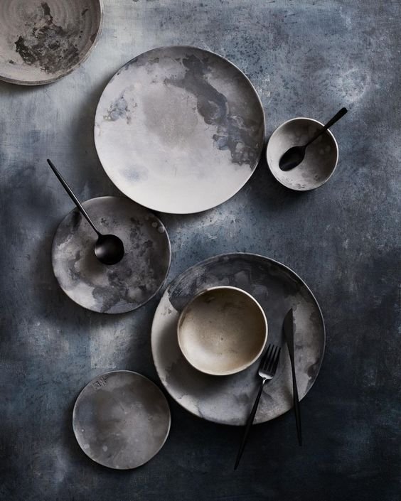
I have followed this account for a while now. Their styling is always on point and I highly recommend you go and follow them if you like pretty crockery. There are two things I want to highlight from this image: Texture & Movement.
Having a plain background, for most cases, is fine. Yet in this specific case, having the artsy, washed, almost watercolor-feel background elevates this image quite a bit. It takes it from a pretty photo to WOW, I need these plates.
I can see this textural background working really well in a spooky photoshoot. In fact, even with Autumn/Fall colors and a minimal product, it would also be lovely. Texture, really adds so much moodiness.
The placement of the product in this flatlay and the way balance has been achieved are phenomenal. Moving your eyes from top to bottom, and left to right is a technique many photographers use, and is super effective.
Image by @kbfoodstyling
http://www.thepropdispensary.com/
FALL + NEUTRAL MINIMAL
You all know I am a sucker for minimalism and neutral vibes. Give me all the Tulum, Santorini, and Villa vibes and I am at my happy place. Yet, for fall, it can be tricky to achieve this look without overdoing it. I love how this brand (Cedar) achieves the feeling of Fall without using a super warm color palette, or the use of too many props. That branch and the arm with the sweater in movement… Love!
Image by @cedarlifestyle.
https://cedarlifestyle.co.uk/

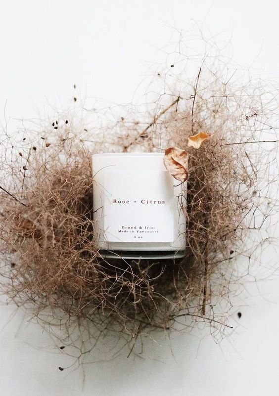
MESSY NEST
Okay, what called my attention was this gorgeous messy nest look. The contrast between the label and the background makes this photo breathtaking. Notice the slight blur of some of the surrounding branches? Definitely on purpose. The attention to detail in this photograph is incredible. Even with those two dried leaves in the right corner, a perfect spot for a touch of color. Well done!
Image by @thelatestscoop_
https://thelatestscoop.ca/
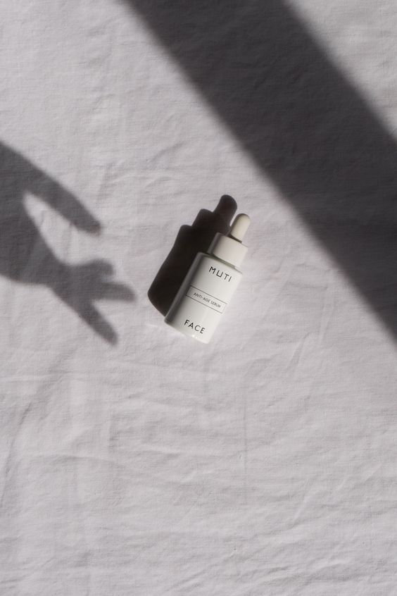
SPOOKY SHADOW
When creating content for events like Halloween, Thanksgiving, Christmas, Easter, 4th of July, and Black Friday, it is easy to fall back on what we expect the marketing to look like for these events. When in fact, we should see it as an opportunity to redefine and rethink the season to match our brand and give it a different (creative) perspective.
I can’t tell you how many times I have designed a post, email, or website banner for a holiday/event and had a client request something like a bat, pumpkin, or a Christmas holly to make it more “seasonal.”
There is nothing Halloweeny about this image. Yet, in the correct context and with the right copy, I can see it working with a Halloween campaign. For example, imagine this image having this caption:
“More effective than the Sanderson sisters’ potion.
This anti-age serum is truly spooky.”
Works right?
Image by @rebeccagoddard
PROPS & LIGHT
I am not a stylist, but I can assure you, props and the art of arranging elements in a frame is an art in itself.
Not every photographer has this skill. In fact, most don’t; so if you have found someone that doesn't both, and doesn't charge you for a styling fee: lucky you!
I admire this skill so much, I can tell when a photograph has been styled. Notice how nothing in this image stands out too much? Even the pear is not saturated, and it blends perfectly. I promise you, there was someone picking the perfect pear for this image.
The light and shadow in this photograph are also worth mentioning. Looks like the light source is coming from the left, yet only the top of the table is lighted up with low contrast between lights and darks. Creating this eerie mood.
Image by @thefreakytable
https://www.zairazarotti.com/

IF YOU FOUND SOMETHING INSPIRING, INTRIGUING, OR ENCOURAGING IN THIS JOURNAL ENTRY—
I WOULD LOVE TO KNOW!
Send me a message in the DMs or contact me to inquire about working together. I can’t wait to keep the conversation going.